
os-single-product (Single Product Card)
What it is
Section titled “What it is”os-single-product fetches one product by slug and renders a product card with pricing, add-to-cart, and optional subscribe action.
Tag name
Section titled “Tag name”os-single-product (Single Product Card)
Attributes / parameters
Section titled “Attributes / parameters”| name | type | required | default | description |
|---|---|---|---|---|
product-slug | string | Yes | None | product-slug="blue-widget" — Product slug used to fetch product card data. |
product-full-url | string | No | None | product-full-url="https://example.com/p/blue-widget" — Full URL used for product-page navigation (takes precedence over product-url-prefix). |
product-url-prefix | string | No | None | product-url-prefix="/products" — URL prefix used to build product-page URLs with product-slug when product-full-url is not provided. |
disable-product-page-link | string | No | None (off) | disable-product-page-link="true" — Stops the card from linking through to the product page. See the note below on how this attribute is read. |
<os-single-product    product-slug="my-product-slug"    product-url-prefix="/products"></os-single-product>
<!-- A card that renders but does not link through to the product page --><os-single-product product-slug="my-product-slug" disable-product-page-link="true"></os-single-product><os-single-product product-slug="my-product-slug" product-url-prefix="/products"></os-single-product>export function FeaturedProduct() { return ( <os-single-product product-slug="my-product-slug" product-url-prefix="/products" disable-product-page-link="true" ></os-single-product> );}Screenshot
Section titled “Screenshot”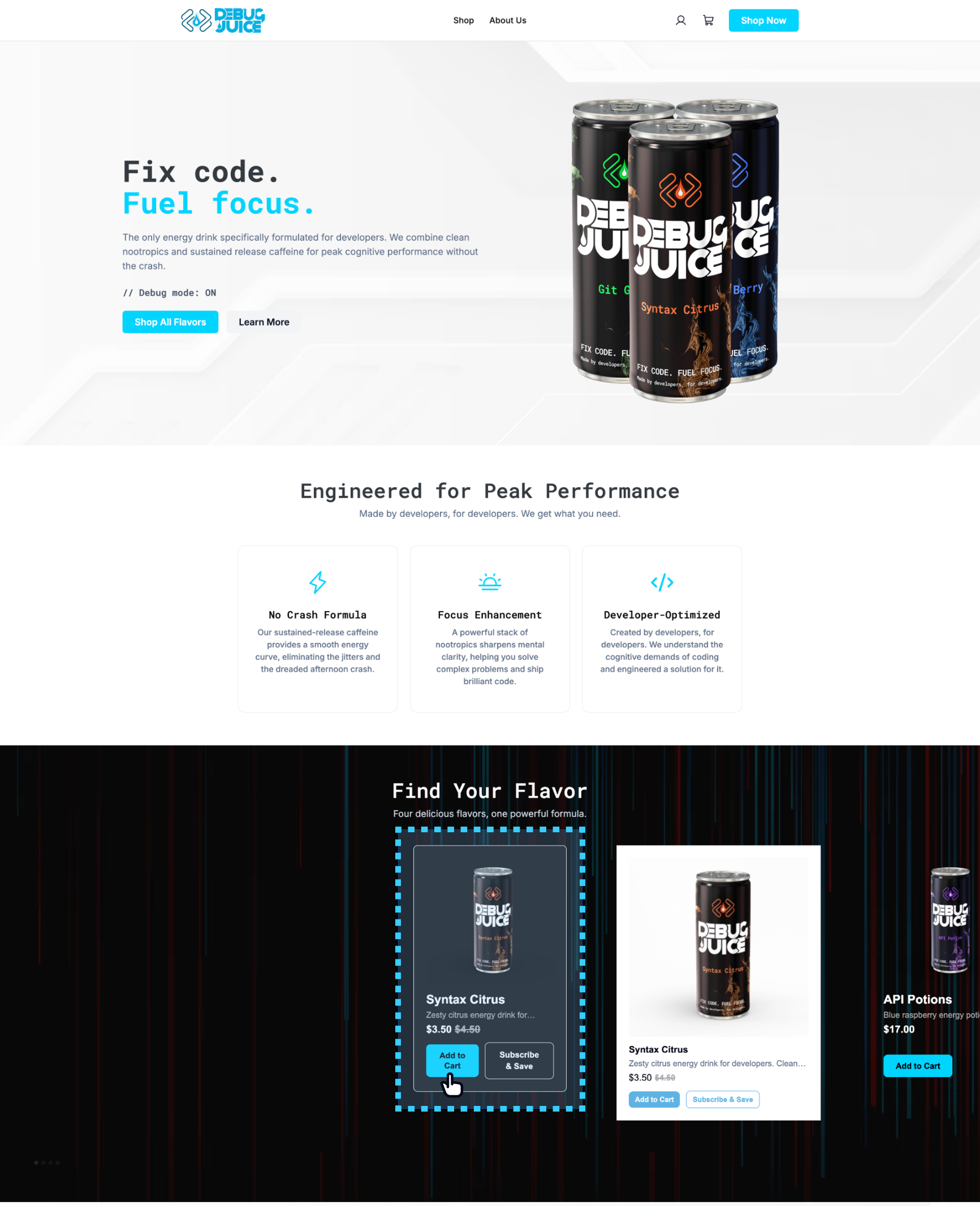
Styling (CSS variables)
Section titled “Styling (CSS variables)”These are in addition to the global tokens inherited by every component.
| CSS variable | Default |
|---|---|
--os-pc-card-bg | #fff |
--os-pc-card-border | 1px solid var(--os-border) |
--os-pc-card-radius | 8px |
--os-pc-card-padding | 24px |
--os-pc-card-gap | 16px |
--os-pc-card-min-width | 300px |
--os-pc-card-max-width | 300px |
--os-pc-card-min-height | 480px |
--os-pc-card-shadow | 0 2px 6px rgba(0, 0, 0, 0.08) |
--os-pc-card-shadow-hover | none |
--os-pc-image-radius | 6px |
--os-pc-image-hover-scale | 1.2 |
Name, subtitle & price
Section titled “Name, subtitle & price”| CSS variable | Default |
|---|---|
--os-pc-name-color | var(--os-foreground) |
--os-pc-name-font-size | 18px |
--os-pc-name-font-weight | 600 |
--os-pc-subtitle-color | var(--os-muted-foreground) |
--os-pc-subtitle-font-size | 16px |
--os-pc-subtitle-font-weight | 400 |
--os-pc-price-color | var(--os-foreground) |
--os-pc-price-font-size | 18px |
--os-pc-price-font-weight | 600 |
--os-pc-price-regular-opacity | 0.4 |
--os-pc-price-regular-text-decoration | line-through |
Ribbon
Section titled “Ribbon”| CSS variable | Default |
|---|---|
--os-pc-ribbon-bg | var(--os-primary) |
--os-pc-ribbon-color | var(--os-primary-foreground) |
--os-pc-ribbon-font-size | 12px |
--os-pc-ribbon-font-weight | 600 |
Add-to-cart button
Section titled “Add-to-cart button”| CSS variable | Default |
|---|---|
--os-pc-add-to-cart-bg | var(--os-primary) |
--os-pc-add-to-cart-bg-hover | #4a4a4f |
--os-pc-add-to-cart-bg-active | #343438 |
--os-pc-add-to-cart-color | var(--os-primary-foreground) |
--os-pc-add-to-cart-radius | 8px |
--os-pc-add-to-cart-padding | 6px 12px |
--os-pc-add-to-cart-font-size | 14px |
--os-pc-add-to-cart-font-weight | 600 |
Subscribe button
Section titled “Subscribe button”| CSS variable | Default |
|---|---|
--os-pc-subscribe-bg | transparent |
--os-pc-subscribe-bg-hover | #f9f9f9 |
--os-pc-subscribe-bg-active | #f0f0f0 |
--os-pc-subscribe-color | var(--os-primary) |
--os-pc-subscribe-border | 1px solid var(--os-primary) |
--os-pc-subscribe-radius | 8px |
--os-pc-subscribe-padding | 6px 12px |
--os-pc-subscribe-font-size | 14px |
--os-pc-subscribe-font-weight | 600 |
Related components
Section titled “Related components” Product List Render many of these cards together as a collection grid.
Product Details The full PDP customers see after clicking this card.