
os-product-list (Product List)
What it is
Section titled “What it is”os-product-list loads available collections and renders a filterable list of products using os-single-product cards.
Tag name
Section titled “Tag name”os-product-list (Product List)
Attributes / parameters
Section titled “Attributes / parameters”| name | type | required | default | description |
|---|---|---|---|---|
product-url-prefix | string | No | None | product-url-prefix="/products" — Prefix used to build product page URLs for child os-single-product cards. |
search | string | No | None | search="true" — Renders the search field above the grid. Must be exactly "true"; any other value (or omitting the attribute) hides it. |
search-scope | "all" | "collection" | No | all | search-scope="collection" — Controls how the search field and the collection chips interact. all always searches every product; collection searches inside the selected collection. An unrecognized value logs a console warning and falls back to all. See the search behavior note below. |
collections-orientation | "horizontal" | "vertical" | No | horizontal | collections-orientation="vertical" — Lays the collection filter chips out in a row above the grid (horizontal) or in a sidebar beside it (vertical). An unrecognized value logs a console warning and falls back to horizontal. |
<os-product-list product-url-prefix="/products"></os-product-list>
<!-- With search enabled and filters in a sidebar --><os-product-list    product-url-prefix="/products"    search="true"    collections-orientation="vertical"></os-product-list>
<!-- Scope the search to the selected collection instead of every product --><os-product-list product-url-prefix="/products" search="true" search-scope="collection"></os-product-list><os-product-list product-url-prefix="/products"></os-product-list>export function Shop() { return ( <os-product-list product-url-prefix="/products" search="true" collections-orientation="vertical" ></os-product-list> );}Screenshot
Section titled “Screenshot”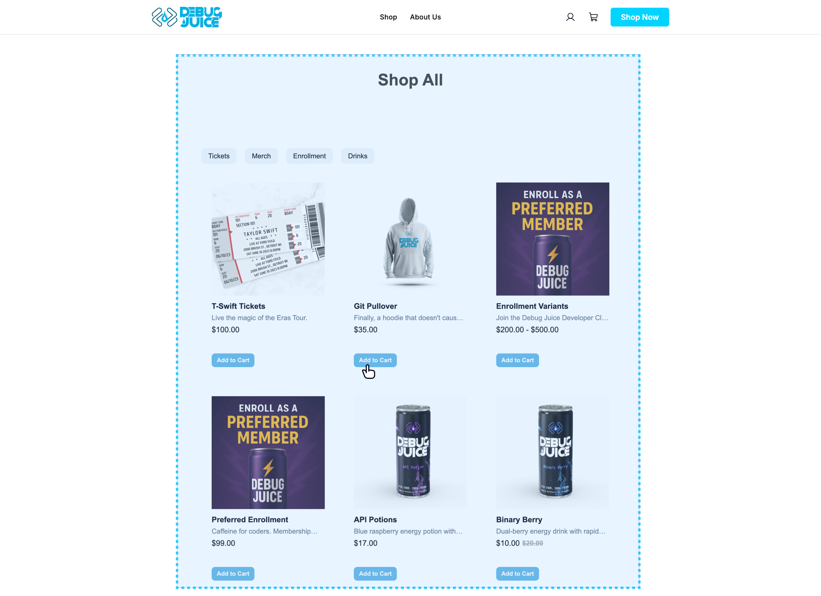
Styling (CSS variables)
Section titled “Styling (CSS variables)”Collection filter chips
Section titled “Collection filter chips”The product list renders the collection filter chips plus a responsive product grid. The chips expose these variables, in addition to the global tokens inherited by every component. (The grid columns are responsive and not exposed as variables.)
| CSS variable | Default |
|---|---|
--os-chip-bg | #f1f5f9 |
--os-chip-color | var(--os-foreground) |
--os-chip-hover-bg | var(--os-border) |
--os-chip-active-bg | var(--os-primary) |
--os-chip-active-color | #fff |
--os-chip-padding | 6px 16px |
--os-chip-radius | 8px |
--os-chip-font-size | 16px |
--os-chip-font-weight | 500 |
--os-chip-line-height | 1.5 |
Search field
Section titled “Search field”Rendered only when search="true".
| CSS variable | Default |
|---|---|
--os-product-list-search-bg | #ffffff |
--os-product-list-search-border | 1px solid var(--os-border) |
--os-product-list-search-color | var(--os-foreground) |
--os-product-list-search-radius | 8px |
--os-product-list-search-height | 40px |
--os-product-list-search-font-size | 16px |
--os-product-list-search-ring-color | #0ea5e9 |
--os-product-list-search-ring-track | var(--os-border) |
--os-product-list-search-status-color | var(--os-muted-foreground) |
--os-product-list-search-status-size | 14px |
--os-product-list-search-status-min-height | 200px |
--os-product-list-search-error-bg | #fef2f2 |
--os-product-list-search-error-color | #b91c1c |
Load more button
Section titled “Load more button”| CSS variable | Default |
|---|---|
--os-product-list-load-more-bg | #ffffff |
--os-product-list-load-more-border | 1px solid var(--os-border) |
--os-product-list-load-more-color | var(--os-foreground) |
--os-product-list-load-more-radius | 8px |
--os-product-list-load-more-font-size | 14px |
Vertical layout & scrolling
Section titled “Vertical layout & scrolling”Applies when collections-orientation="vertical".
| CSS variable | Default |
|---|---|
--os-product-list-vertical-filters-width | 200px |
--os-product-list-vertical-gap | 32px |
--os-product-list-scroll-margin | 0 |
Loading spinner
Section titled “Loading spinner”| CSS variable | Default |
|---|---|
--os-spinner-color | #3b82f6 |
--os-spinner-size | 12px |
Related components
Section titled “Related components” Single Product Card The card rendered for each item in this list.
Product Details The destination page customers land on after clicking a card.