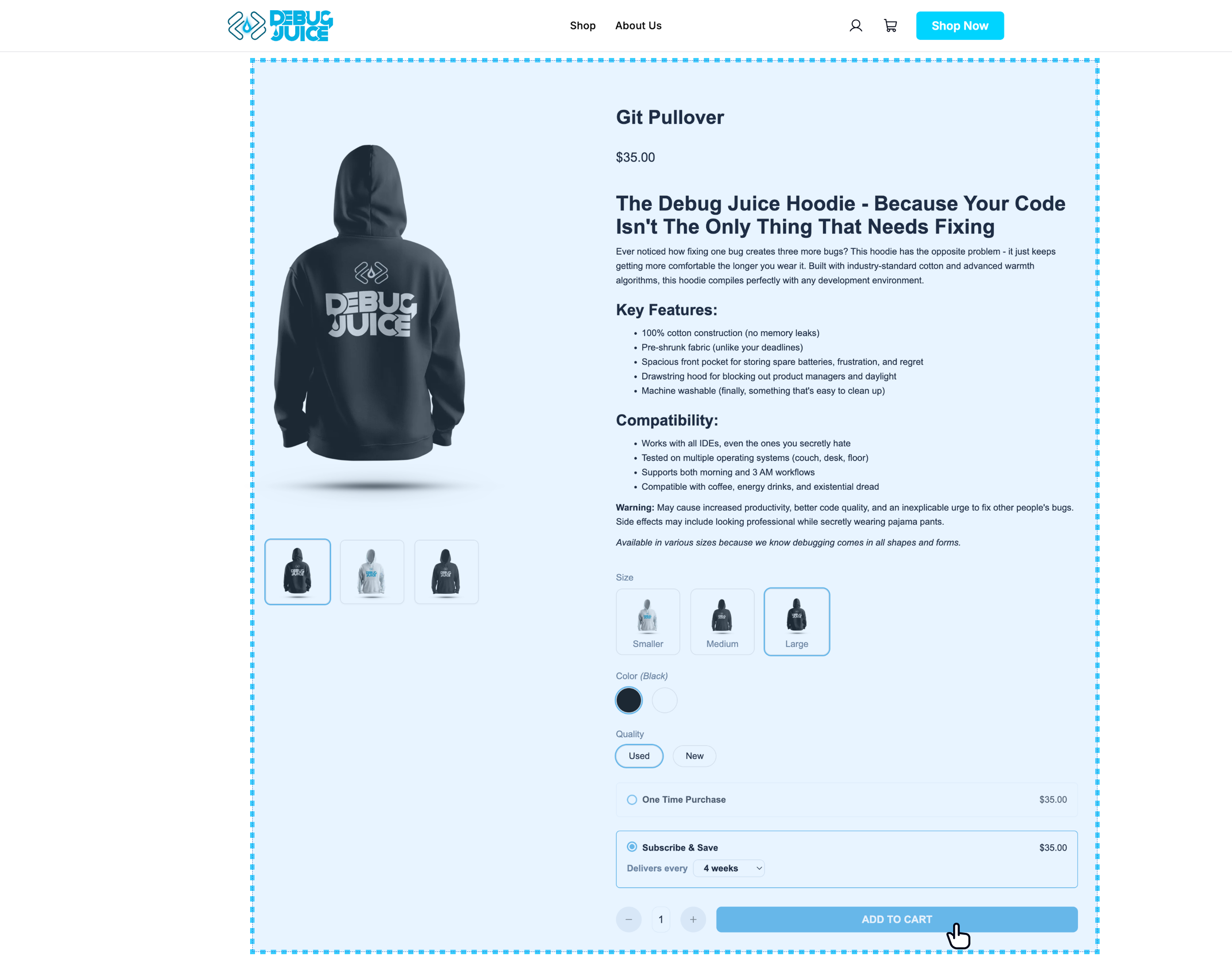
os-product-details fetches one product by slug and renders a full PDP-style experience, including media gallery, attribute selectors, purchase options, and add-to-cart.
os-product-details (Product Details)
name type required default description product-slugstringYes None product-slug="blue-widget" — Product slug used to fetch and render product details.
editCartItem query parameter
This component also reads an editCartItem=<cartItemId> query parameter from the page URL. When
present and the id resolves to a line in the current cart for this product, the page seeds its
selections from that line and the CTA updates that line instead of adding a new one. The cart
slideout produces these URLs from its Edit options link — see
os-cart-slideoutproduct-url-prefix. It is a URL parameter,
not an HTML attribute, so there is nothing to set on the tag.
< os-product-details product-slug = "my-product-slug" ></ os-product-details >
< os-product-details product-slug = "my-product-slug" ></ os-product-details >
export function ProductPage ({ slug }) {
return < os-product-details product-slug = { slug } ></ os-product-details > ;
Product details is themed primarily through the global tokens (--os-foreground, --os-muted-foreground, --os-primary, --os-primary-foreground, --os-border) inherited by every component. The controls it renders each expose their own variables below.
CSS variable Default --os-select-background-color #ffffff --os-select-border-color var(--os-border) --os-select-hover-background-color #f0f0f0 --os-select-checked-background-color #f0f0f0 --os-select-checkmark-color #025712 --os-select-font-size 16px --os-select-disabled-opacity 0.4 --os-dropdown-attribute-selector-min-width 160px
An attribute renders as swatches, images, or a button list depending on how it is configured in
admin. Values that no combination can reach are rendered as unavailable rather than hidden, and
these variables control that treatment.
CSS variable Default --os-button-list-attribute-selector-unavailable-color #c3c8cf --os-button-list-attribute-selector-unavailable-border #eef0f2 --os-button-list-attribute-selector-unavailable-opacity 0.4 --os-color-attribute-selector-unavailable-opacity 0.45 --os-color-attribute-selector-unavailable-slash-color #6b7280 --os-image-attribute-selector-placeholder-background #f0f1f3 --os-image-attribute-selector-placeholder-radius 8px --os-image-attribute-selector-unavailable-opacity 0.4
CSS variable Default --os-quantity-stepper-bg #ffffff --os-quantity-stepper-border 1px solid var(--os-border) --os-quantity-stepper-radius 10px --os-quantity-stepper-height 44px --os-quantity-stepper-disabled-opacity 0.5 --os-quantity-stepper-step-color var(--os-muted-foreground) --os-quantity-stepper-step-size 16px --os-quantity-stepper-step-width 32px --os-quantity-stepper-value-color var(--os-foreground) --os-quantity-stepper-value-size 14px --os-quantity-stepper-value-weight 600 --os-quantity-stepper-value-width 22px
CSS variable Default --os-add-to-cart-bg var(--os-primary) --os-add-to-cart-color var(--os-primary-foreground) --os-add-to-cart-disabled-bg #c3c8cf --os-add-to-cart-disabled-color #ffffff --os-add-to-cart-height 44px --os-add-to-cart-padding 0 20px --os-add-to-cart-radius 10px --os-add-to-cart-size 14px --os-add-to-cart-weight 600
Rendered only for bundle/pack products, where the shopper fills each slot before adding to cart.
It is the largest surface on the page, so its variables are grouped by area.
CSS variable Default --os-bundle-selector-bg #ffffff --os-bundle-selector-ink var(--os-foreground) --os-bundle-selector-body-color #4b5563 --os-bundle-selector-muted var(--os-muted-foreground) --os-bundle-selector-faint #9aa1ab --os-bundle-selector-divider #e9ecef --os-bundle-selector-shadow 0 2px 6px rgba(15, 17, 21, 0.1) --os-bundle-selector-scrollbar #dde1e6 --os-bundle-selector-panel-padding 16px --os-bundle-selector-section-gap 18px --os-bundle-selector-control-radius 12px --os-bundle-selector-unavailable-opacity 0.45
CSS variable Default --os-bundle-selector-accent var(--os-primary) --os-bundle-selector-accent-foreground var(--os-primary-foreground) --os-bundle-selector-accent-border #d6def7 --os-bundle-selector-accent-thumb #e7ecf5 --os-bundle-selector-accent-tint #f5f8ff --os-bundle-selector-accent-tint-strong #eaf0ff
CSS variable Default --os-bundle-selector-heading-size 20px --os-bundle-selector-heading-weight 700 --os-bundle-selector-heading-meta-size 14px --os-bundle-selector-progress-track #e3e6ea --os-bundle-selector-progress-height 6px --os-bundle-selector-progress-size 14px --os-bundle-selector-progress-weight 600 --os-bundle-selector-summary-size 14px --os-bundle-selector-summary-weight 600 --os-bundle-selector-total-size 20px --os-bundle-selector-total-weight 700 --os-bundle-selector-footer-gap 16px --os-bundle-selector-footer-padding 18px 0 0 0
CSS variable Default --os-bundle-selector-row-border #e3e6ea --os-bundle-selector-row-border-width 1.5px --os-bundle-selector-row-padding 14px 16px --os-bundle-selector-row-radius 12px --os-bundle-selector-slot-label-size 12px --os-bundle-selector-slot-label-weight 600 --os-bundle-selector-slot-thumb-size 48px --os-bundle-selector-thumb-radius 8px --os-bundle-selector-tile-width 120px --os-bundle-selector-tile-radius 10px --os-bundle-selector-tile-name-size 14px --os-bundle-selector-tile-name-weight 600 --os-bundle-selector-tile-note-size 12px --os-bundle-selector-placeholder-bg #f0f1f3 --os-bundle-selector-placeholder-muted-bg #f4f5f6 --os-bundle-selector-fixed-bg #fbfcfc --os-bundle-selector-scroll-button-size 36px --os-bundle-selector-attribute-label-size 12px --os-bundle-selector-attribute-label-weight 600
CSS variable Default --os-bundle-selector-purchase-option-padding 14px 16px --os-bundle-selector-purchase-option-border-width 2px --os-bundle-selector-option-label-size 14px --os-bundle-selector-option-label-weight 600 --os-bundle-selector-option-price-size 16px --os-bundle-selector-option-price-weight 700 --os-bundle-selector-frequency-bg #fbfcff --os-bundle-selector-frequency-padding 14px 16px --os-bundle-selector-cadence-size 14px --os-bundle-selector-cadence-weight 600 --os-bundle-selector-chip-border #dde1e6 --os-bundle-selector-chip-border-width 1.5px --os-bundle-selector-chip-color #374151 --os-bundle-selector-chip-padding 9px 16px --os-bundle-selector-chip-size 14px --os-bundle-selector-chip-weight 600 --os-bundle-selector-pill-padding 6px 14px --os-bundle-selector-pill-radius 999px --os-bundle-selector-pill-size 12px --os-bundle-selector-pill-weight 600 --os-bundle-selector-badge-bg #e4f5ec --os-bundle-selector-badge-color #0b6b4f --os-bundle-selector-badge-padding 3px 8px --os-bundle-selector-badge-size 12px --os-bundle-selector-badge-weight 700
CSS variable Default --os-bundle-selector-message-bg var(--os-foreground) --os-bundle-selector-message-color #ffffff --os-bundle-selector-message-padding 14px 18px --os-bundle-selector-message-size 14px --os-bundle-selector-message-weight 500
Product List The collection grid customers browse before landing here.