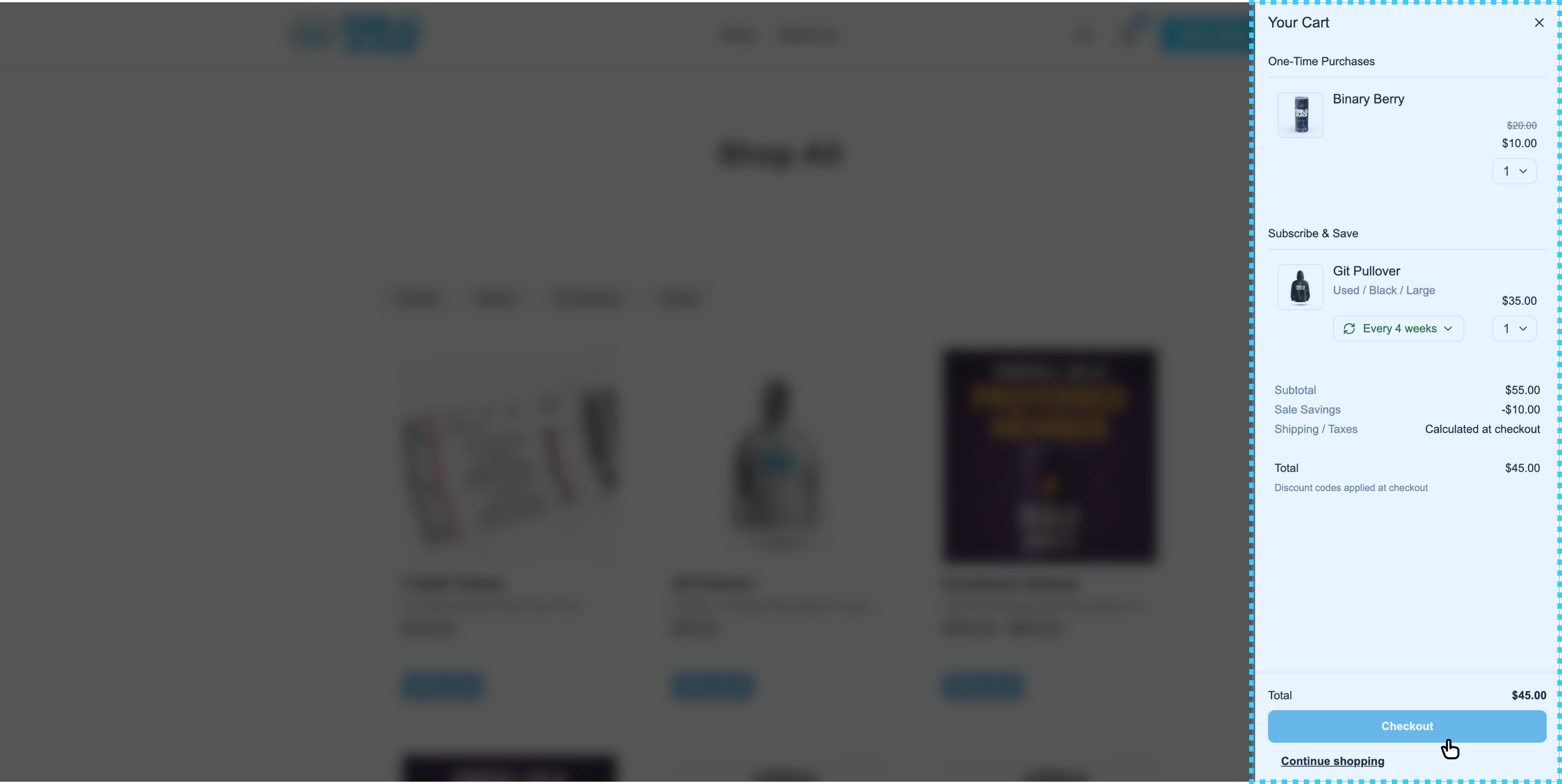
os-cart-slideout renders the cart overlay and slideout panel, including line items, quantity controls, and checkout/continue actions.
os-cart-slideout (Cart Slideout)
name type required default description product-url-prefixstringNo None product-url-prefix="/products" — Where your store serves product pages. Used to build the Edit options link on a bundle/pack line so shoppers can jump back to that product’s configurator. Without it, the link is not rendered.
< os-cart-slideout product-url-prefix = "/products" ></ os-cart-slideout >
< os-cart-slideout product-url-prefix = "/products" ></ os-cart-slideout >
export default function App () {
return < os-cart-slideout product-url-prefix = "/products" ></ os-cart-slideout > ;
These are in addition to the global tokens inherited by every component.
CSS variable Default --os-cart-width 375px --os-cart-bg #fff --os-cart-shadow 0 2px 16px rgba(0, 0, 0, 0.12) --os-cart-overlay-bg #0c0c0dbf --os-cart-title-color var(--os-foreground) --os-cart-title-size 18px --os-cart-title-weight 500 --os-cart-title-line-height 1 --os-cart-section-title-color var(--os-foreground) --os-cart-section-title-size 14px --os-cart-section-title-weight 500 --os-cart-section-title-line-height 1 --os-cart-section-divider-color var(--os-border)
CSS variable Default --os-cart-empty-header-color var(--os-foreground) --os-cart-empty-header-size 24px --os-cart-empty-header-weight 600 --os-cart-empty-subheader-color var(--os-foreground) --os-cart-empty-subheader-size 14px
CSS variable Default --os-cart-summary-padding 12px 8px --os-cart-summary-row-color var(--os-muted-foreground) --os-cart-summary-row-size 14px --os-cart-summary-row-value-color var(--os-foreground) --os-cart-summary-total-color var(--os-foreground) --os-cart-summary-note-color var(--os-muted-foreground) --os-cart-summary-actions-total-row-color var(--os-foreground) --os-cart-summary-actions-total-row-size 14px --os-cart-summary-actions-total-row-weight normal --os-cart-summary-actions-total-row-total-weight 600 --os-cart-summary-actions-total-row-line-height 1.43
CSS variable Default --os-cart-btn-radius 8px --os-cart-btn-primary-bg var(--os-primary) --os-cart-btn-primary-bg-hover #0299c6 --os-cart-btn-primary-bg-active #027fa3 --os-cart-btn-primary-color #fff --os-cart-btn-link-color var(--os-foreground) --os-cart-btn-link-bg-active var(--os-border) --os-cart-btn-secondary-bg transparent --os-cart-btn-secondary-bg-hover var(--os-border) --os-cart-btn-secondary-border var(--os-primary) --os-cart-btn-secondary-color var(--os-primary)
CSS variable Default --os-cart-item-padding 6px 12px --os-cart-item-image-border 1px solid var(--os-border) --os-cart-item-image-radius 6px --os-cart-item-name-color var(--os-foreground) --os-cart-item-name-size 16px --os-cart-item-name-weight 500 --os-cart-item-name-line-height 1 --os-cart-item-desc-color var(--os-muted-foreground) --os-cart-item-desc-size 14px --os-cart-item-desc-line-height 1.43 --os-cart-item-price-color var(--os-foreground) --os-cart-item-price-size 14px --os-cart-item-price-weight 500 --os-cart-item-original-price-color var(--os-muted-foreground) --os-cart-item-original-price-size 12px --os-cart-item-frequency-border 1px solid var(--os-border) --os-cart-item-frequency-color #025712 --os-cart-item-qty-color var(--os-foreground) --os-cart-item-qty-padding 2px --os-cart-item-qty-border-hover var(--os-border) --os-cart-item-qty-border-focus-shadow 0 0 0 3px rgba(59, 130, 246, 0.1) --os-cart-item-subscribe-bg transparent --os-cart-item-subscribe-bg-hover var(--os-border) --os-cart-item-subscribe-bg-active #cbd5e1 --os-cart-item-subscribe-color var(--os-foreground) --os-cart-item-subscribe-border 1px solid var(--os-border) --os-cart-item-subscribe-radius 8px --os-cart-item-subscribe-padding 0px 12px --os-cart-item-subscribe-size 14px --os-cart-item-contains-color var(--os-muted-foreground) --os-cart-item-contains-charge-color var(--os-foreground) --os-cart-item-contains-size 12px --os-cart-item-edit-options-color var(--os-primary) --os-cart-item-edit-options-size 12px --os-cart-item-free-cycle-note-color #025712 --os-cart-item-free-cycle-note-size 12px --os-cart-item-stock-hint-color var(--os-muted-foreground) --os-cart-item-stock-hint-size 12px
The contains-* rows style the bundle/pack contents list on a line; edit-options-* styles the link
back to the configurator (only rendered when product-url-prefix is set); free-cycle-note-* styles
the “first cycle free” note on a subscription line; and stock-hint-* styles the low-stock hint.
CSS variable Default --os-select-background-color #ffffff --os-select-border-color var(--os-border) --os-select-hover-background-color #f0f0f0 --os-select-checked-background-color #f0f0f0 --os-select-checkmark-color #025712 --os-select-font-size 16px --os-select-disabled-opacity 0.4
Rendered above the summary when the cart qualifies for tiered discounts.
CSS variable Default --os-tier-progress-padding 0 16px 12px --os-tier-progress-card-bg #f8fafc --os-tier-progress-card-padding 12px --os-tier-progress-card-radius 8px --os-tier-progress-accent var(--os-primary) --os-tier-progress-track-color var(--os-border) --os-tier-progress-track-height 8px --os-tier-progress-track-radius 999px --os-tier-progress-eyebrow-color var(--os-muted-foreground) --os-tier-progress-eyebrow-size 11px --os-tier-progress-tier-color var(--os-foreground) --os-tier-progress-tier-size 16px --os-tier-progress-discount-size 13px --os-tier-progress-milestone-color var(--os-muted-foreground) --os-tier-progress-milestone-size 11px --os-tier-progress-callout-color var(--os-foreground) --os-tier-progress-callout-size 13px
Rendered when the store returns free-shipping progress for the cart. Every variable below falls back
to its --os-tier-progress-* counterpart, so theming tier progress restyles this bar too — override
these only when you want the two bars to differ.
CSS variable Default --os-free-shipping-progress-padding var(--os-tier-progress-padding, 0 16px 12px) --os-free-shipping-progress-card-bg var(--os-tier-progress-card-bg, #f8fafc) --os-free-shipping-progress-card-padding var(--os-tier-progress-card-padding, 12px) --os-free-shipping-progress-card-radius var(--os-tier-progress-card-radius, 8px) --os-free-shipping-progress-accent var(--os-tier-progress-accent, var(--os-primary)) --os-free-shipping-progress-track-color var(--os-tier-progress-track-color, var(--os-border)) --os-free-shipping-progress-track-height var(--os-tier-progress-track-height, 8px) --os-free-shipping-progress-track-radius var(--os-tier-progress-track-radius, 999px) --os-free-shipping-progress-eyebrow-color var(--os-tier-progress-eyebrow-color, var(--os-muted-foreground)) --os-free-shipping-progress-eyebrow-size var(--os-tier-progress-eyebrow-size, 11px) --os-free-shipping-progress-amounts-color var(--os-tier-progress-tier-color, var(--os-foreground)) --os-free-shipping-progress-amounts-size 13px --os-free-shipping-progress-callout-color var(--os-tier-progress-callout-color, var(--os-foreground)) --os-free-shipping-progress-callout-size var(--os-tier-progress-callout-size, 13px)
The Share cart dialog (with the shareable link) and the warning dialog shown when some lines
cannot be shared. Both reuse the cart’s panel and button variables above; these are additional.
CSS variable Default --os-cart-border #e2e8f0 --os-background #fff --os-share-name-color var(--os-cart-title-color, var(--os-foreground)) --os-share-count-color var(--os-cart-summary-row-color, var(--os-muted-foreground))
CSS variable Default --os-spinner-color #3b82f6 --os-spinner-size 12px
Cart Button The toggle that opens this slideout from anywhere on your page. Product List Surface products that customers can add into this cart.